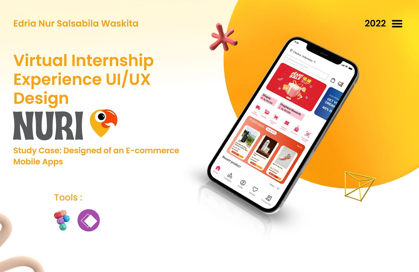
UI/UX Case Study: Optimizing the Cash on Delivery Payment Process in an E-commerce App
--
Disclaimer: This project was created as part of my Virtual Internship Experience Program in Nuri held by Rakamin Academy. I was responsible for the whole process starting from research, conducting interviews, competitive analysis, create product design, prototyping.
The focus of this case study project is to design an E-commerce mobile application, and as a UI/UX Designer, I was responsible for conducting user research and analysis, developing user flows and wireframes, and designing the visual elements of the E-commerce app.
Let’s get started, shall we?…🚀
Overview
An E-commerce app is a digital platform that enables customers to shop online and purchase items from a variety of stores and merchants. Companies like Tokopedia and Shopee are examples of e-commerce apps, which allow users to browse and purchase a wide range of products and services from the comfort of their own devices.
Duration: 1 week
The Challenge
Online shopping has become very popular in recent months. There were so many marketplaces to choose from, each offering a unique selection of products and payment options. One of the most popular options was Cash On Delivery. No need to dig for a card at checkout or wait for a bank transfer — customers could simply pay in cash when their order arrived. However, some customers have taken advantage of this payment method by not paying for their orders.
Therefore, the goals of this project are:
- To find out why people misuse COD
- to solve the problem using design thinking
My Roles👩🏻💻
As I worked on this case study, I took the following steps:
- UX Researcher: Understanding the needs and behaviors of a product’s users by using methods like interviews and usability testing to gather data and inform the design process.
- UX Designer: Conduct user research, design wireframes and prototypes, and conduct user testing to ensure that a product is easy to use and meets the needs of its users.
- UI Designer: Creating the look and feel of a product. Focus on things like the layout, color scheme, and overall aesthetic of a product.
Design Process✍🏻
In making this study case, I used the Design Thinking framework to create a structured Design Process to solve the problems. It has 5 stages: Empathize, Define, Ideate, and Prototype. While working on this project, I was unable to conduct usability testing due to the constraints of the case study project as provided by my internship at Nuri. Despite the constraints of the case study project, I believe that the research and design work I completed is still valuable and demonstrates my ability to create user-centered design solutions.

Empathize🔍
Defining the Objective
The purpose of this case study is to find out the motivations & pain points of customers taking advantage of the Cash On Delivery payment method by not paying for their orders.
Target Audience Demographics
In order to better understand online shopping behavior and identify common problems, I conducted interviews with :
- 5 online shoppers
- female and male
- 23–35 years old
By speaking with a representative sample of this age group, I was able to gather valuable insights into user behavior and pain points, which will be useful in improving the online shopping experience for consumers.
Research Question
There were several main questions that had to be answered through this research. Some of the main questions included :
- Have you used e-commerce applications before? How often?
- What items do you usually buy on the e-commerce apps?
- Do you know about the COD payment option?
- Have you bought items on the e-commerce apps using COD?
- What do you think about buying things on e-commerce apps using COD?
Research Insights
Through interviews with a number of respondents, we were able to gain insight into the user experience of online shopping with the COD payment option. We compiled this insight into an empathy map and user persona for analysis.

Through these interviews, we were able to identify several key insights that inform the problem statement.
✨Insights
- User data security may be lacking, resulting in unauthorized COD orders or delivery addresses being given to someone else.
- Some customers may not fully understand COD regulations.
- There have been reports of certain e-commerce platforms processing COD orders immediately, without any confirmation or option to cancel.
- Incidents of customers receiving and being charged for COD deliveries they didn’t order.
- The interviewee generally likes the idea of COD as it allows for cash payment and the option to cancel if the order doesn’t meet expectations.
- The interviewee is concerned about becoming the victim of unwanted COD deliveries, particularly for expensive items.
✨Problem Statement
Customers are facing issues with Cash on Delivery (COD) orders such as:
- Unauthorized orders being placed
- Lack of understanding of COD regulations
- Orders being processed immediately without confirmation
- Receiving and being charged for unwanted deliveries
These issues lead to:
- Confusion among customers
- Fear of unwanted deliveries
- Dissatisfaction with the COD process.
Define📝
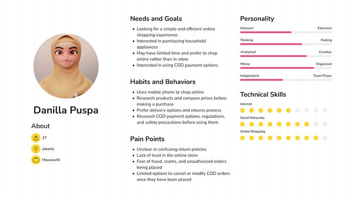
The next step I did was to create a User Persona. Based on the research results, I made a user persona to understand user behavior, needs, experience, and goals. By creating this user persona, I could design the interface to the user’s needs and ensure the final product met user-specific needs.
User Persona
User Journey Map
I created the user journey map by using the user’s experience, gained from observation and analysis of the user persona, to understand the user’s journey and possible problems.

Ideate🎨
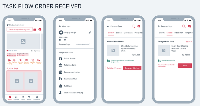
User Flow
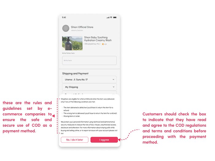
The next step is creating the user flow, which illustrates the complete path a user takes when using the product. In this case, I’m creating a user flow for the checkout process with the COD payment method and the option to cancel products in the transaction history.


Design
- Low Wireframes
I initiated the design process by creating a low-fidelity wireframe. For this project, I used Whimsical for the low wireframe. The wireframe helped me in focusing on key functions, elements, and actions before proceeding to the high-fidelity designs.

- Style Guide
Before creating the high-fidelity design, I created a style guide that utilizes reusable components and patterns to handle design at a large scale. This approach ensures consistency and cohesiveness throughout the design process, it also allows for easy maintenance and updates of designs in the future.

I found the Urbanist typeface’s unique design and readability features. It’s also versatile and legible, making it suitable for various design projects, including UI and web design. Additionally, it has a high level of readability, even in small sizes, which makes it ideal for use in digital designs.

I use pink-red as the main color because these colors are associated with positive emotions and can create a sense of excitement and urgency which can drive users to make purchases and also highly visible colors, which can help to draw attention to the app.
- High Fidelity Wireframe
With the low-fidelity wireframe and style guide in place, I moved on to creating the high-fidelity design. The high-fidelity design covered all visual aspects of the product and was used to validate the design decisions, providing a more polished and realistic representation of the final product.


Let’s Dive into The Prototype Now!
After finalizing the high-fidelity User Interface design, a prototype was created for testing with potential users. I welcome you to test and provide feedback on the prototype here💻 📝
I appreciate you taking the time to read through my UI/UX case study. If you have any thoughts or feedback on the UI/UX design of the COD payment method application, please share them in the comments section. Thank you again for your time\^o^/
Reach out to me at
📞 0851– 6189 – 3025
📱 My Social Media
